
Want the secondhand scoop?


Branding your vintage shop or service part 5: How visuals can earn customer trust
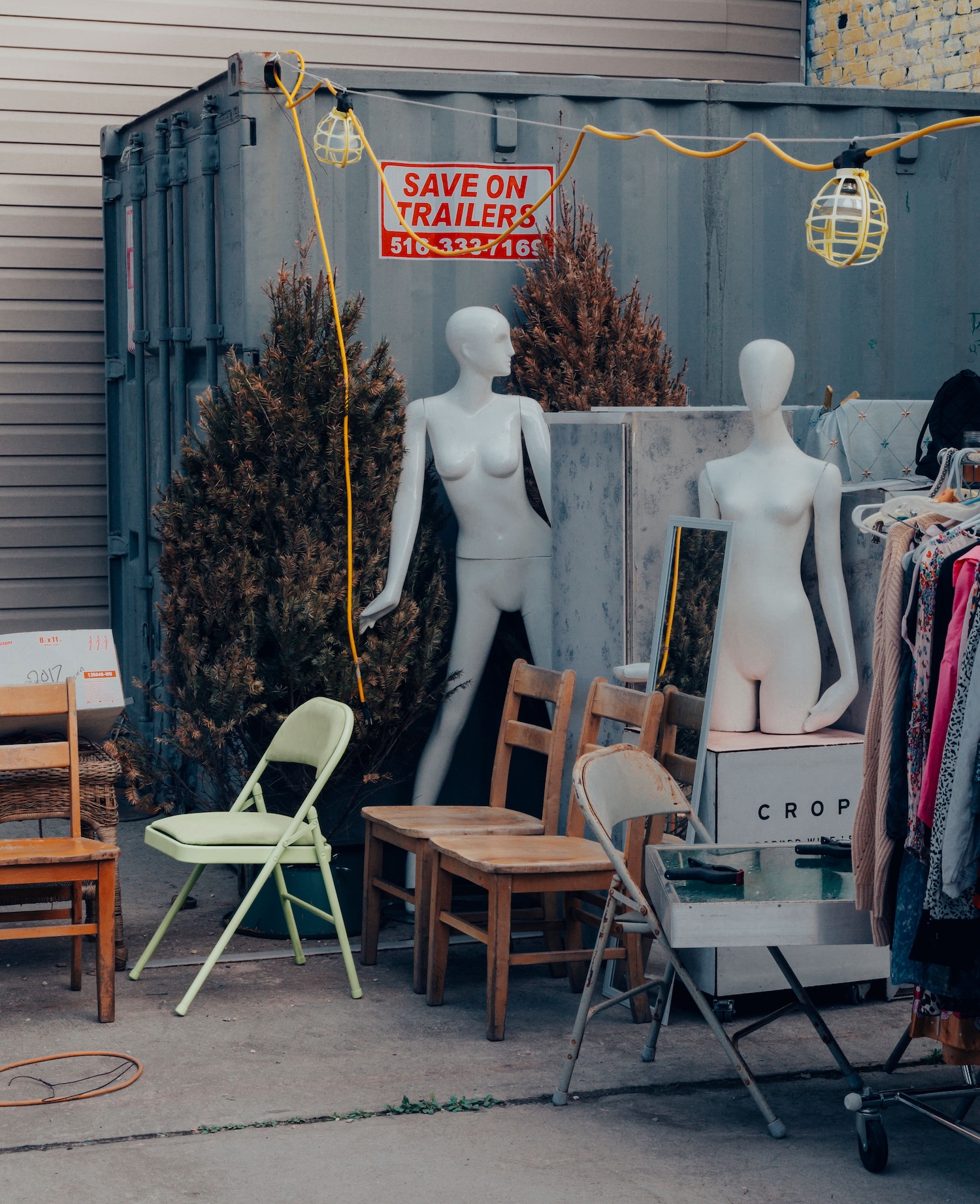
The fun and final part of branding? Your visual identity. Find out how to put all of our branding advice into action with specific-to-vintage examples
We’ve made it to the fun (and final) part of branding!
Here’s what we’ve already covered:
What is brand voice?
- How to find your brand voice
- How to develop a brand tone
- How to create brand and content pillars
We now know why we are saying something (values & mission), why people should listen when we are saying it (USP), who we are saying it to (audience/customer personas), how we are saying it (tone) and what we are saying (content pillars).
This is all work you’ve been doing on the inside part of your shop. So what does all of that look like, wrapped up in a package, on the outside? That’s your brand identity.
What is a brand identity?
Brand identity is a fancy phrase for the visuals of your business. This includes colours, patterns and images, and your logo. Put them all together, and they form the basis of all of your content and communications for your shop brand.
The “identity” part is important. Like your own personal identity, we are talking about things that comprise your shop’s distinguishing characteristics. We’ve just spent all this time determining what those characteristics are, so your visuals should reflect that!
The brand identity consists of:
- Logo: The heart of your shop’s brand, and usually consists of a wordmark (your shop’s name) and a graphic element. Consider having a couple of logo variations that work for different applications, such as graphic only, wordmark only and both in horizontal and square formats.
- For example, a vintage clothing shop that specializes in 1930s and ’40s pieces might include an Art Deco motif in their logo.
- For example, a vintage clothing shop that specializes in 1930s and ’40s pieces might include an Art Deco motif in their logo.
- Colours & Patterns: Pick a palette that references the tone of your shop, and use the colours across everything and anything you create for your shop: Tags, bags, tissue, ribbon, logo, social media graphics, website, email marketing, email signature, etc. You can also use patterns.
- For example, if your shop is focused on sustainability, you might consider green in your colour palette. But if you are sustainable and still want your brand to carry a fun, approachable tone, green might feel too subdued. You might want to pair the green with a more “fun” secondary colour like orange, yellow, purple or pink.
- For example, if your shop is focused on sustainability, you might consider green in your colour palette. But if you are sustainable and still want your brand to carry a fun, approachable tone, green might feel too subdued. You might want to pair the green with a more “fun” secondary colour like orange, yellow, purple or pink.
- Typography: Choose fonts that reflect your brand voice and tone. Some fonts are whimsical and cute, others are staid and serious. Consider how you want your shop to be perceived in market.
- For example, if you run an antique shop frequented by women over 50, your choice may not be an all-caps, heavy display font but an elegant script that might be better received by your target audience.
- For example, if you run an antique shop frequented by women over 50, your choice may not be an all-caps, heavy display font but an elegant script that might be better received by your target audience.
- Images: Illustration, photography and graphics that reference your brand voice and tone. Try to be consistent with styles, whether in the images themselves or with whatever visual treatment you give to the images.
- For example, if you run a boho/’70s/midcentury decor shop, you may want your photographs to all have a folksy, faded feel to them, and, if you’re using illustrations, you may want retro lines. Or maybe you want all the photographs to feel cohesive all the time no matter the photographic style, so you apply a brown-toned filter or sepia wash any time you use a photo.
What a good brand identity can do for your shop
1) It makes you memorable.
When applied consistently over time, a good brand identity helps customers to get to know your shop.
Using the same colours, fonts and styles repeatedly sends subtle signals to your customers (and/or your followers), and they begin to recognize your content and your promotions. That’s how your shop starts to stand out in a sea of competing priorities.
For example, if we take our streetwear seller Henry, let’s say he uses different colours, fonts and style of graphics every time he posts something on social media.
If someone is scrolling quickly, there are no signals telling them that Henry has posted, other than if they happen to see his username as they fly by in the feed. There’s nothing else to make the user’s brain stop and say, “Henry is having some kind of sale! I should pause and see what it’s all about.”
Using cohesive colours and fonts lets people recognize where the content is coming from.
2) It heightens your authority.
A cohesive “look” to your shop appears professional and like you have an established business (even if you’re new!).
It elevates the customer experience, signals to a potential customer that you have invested in your shop (even if you DIY, you’re investing your time), and that they may be able to trust your business.
3) It reduces overwhelm.
Having a set brand identity cuts a clear path when you are assembling social media promotions, marketing emails, market booth signage, store displays, online marketplace storefronts, etc.
There’s no guesswork on how to make anything look, because you just need to refer to your brand identity and grab your colours, logo and graphics.
Continued below
Find vintage and antique shops near you
Browse our directory
Continued from above
4) It makes your shop special.
Because you are using your USP to help formulate your brand visuals, your logo, colour palette, images and typography should be uniquely you.
Your brand visuals shouldn’t be a complete template package you picked up in Canva (though you can start there and play around with them!), but a representation of your brand voice. And you’re the only one who has your particular brand voice.
5) It increases customer loyalty.
If your shop’s brand identity is informed by who your customers are, it’s more likely to resonate with them. They feel more emotionally attached.
And if customers happen to love the look of your shop, they might even keep bits and pieces of it around — the handwritten note on your branded postcard that you included with their order, for example.
Or, think about the retail brands that you buy from. If two dishwasher detergents offer the same features at the same price, why do you choose one over the other? It may have to do with how the packaging looks, or what the packaging makes you feel. Maybe it’s the same brand you grew up with at home, so it makes you feel a sense of nostalgia.
Creating an opportunity for emotional connection is the kind of ongoing promotion that you can’t buy.
6) It helps you grow.
Choosing a colour palette, typography and building several logo variations positions your shop to scale.
Whenever you add more streams to your business, you can extend and evolve your brand identity to incorporate rather than start from scratch every time.
Translating brand voice into brand identity
So how do you turn all of this brand voice stuff into visuals?
When thinking about your brand identity, ask yourself these questions:
- What specific characteristics from my mission, values, USP, and brand pillars do I want to ensure are represented in my visuals? (It’s unlikely you will be able to include everything, so hone in on the most essential elements.)
- How do I want people to feel when they encounter my shop visuals? What words come to mind?
- When I think about my brand tone, what words come to mind?
Let’s use our example of Henry who sells vintage clothing and streetwear. He does same-day delivery and offers style bundles. His target market is men aged 25-35, he wants to help customers with styling and provide inspiration, and he wants his brand tone to be fun, engaging and nostalgic for his potential customers.
In developing a logo, Henry might want to explore a way to visualize what his USP is. He puts together a “mood board,” pulling together colours he likes as well as images that reflect what he wants his customers to know about his shop.
He brings in yellow and red and white, which are some of the colours that remind him of the colourful ’80s and ’90s streetwear he stocks. He wants people to get that same hit of nostalgia when they see his shop brand.
He sketches the logo’s graphic element as a delivery truck, but the flatbed/box behind the cab is actually not a box, but a “style bundle” of clothing. In the centre of the truck hubcaps, he draws light bulbs (to represent innovation) in a graffiti style that will resonate more with his potential customers. He adds a “whoosh” element behind the truck to indicate speedy delivery.
Since Henry is in the same age range as his target customers, he researches the typography of major retail brands he likes and chooses three fonts that have a similar look, to create an emotional and familiar connection.
Steps to a brand identity
- Reflect on your values, mission, USP, audience, tone and brand pillars. What key points do you want to convey with your brand identity? List the points and any words you want to get across with your visuals.
- Create a mood board: Use Pinterest or Canva to create a visual mood board that represents the aesthetic and emotions you want your shop to convey.
- Use your mood board or a colour palette generator like Coolors or Canva to choose a colour palette with 1 main colour, 2-4 complementary colours, and 1-2 accent colours or patterns. Consider graphic elements as well as headline and body copy colour options.
- Sketch out 2-3 logo variations. Try wordmark only and a wordmark/graphic combination. Use a pen and paper, start from scratch in Canva or use its built-in logo maker, or try another free logo maker like Adobe Express.
- Use Canva or Google Fonts, or a font pairing generator like Fontjoy or Fontpair to choose 2-3 fonts/typefaces: 1 primary for headlines/main text, and 1-2 secondary for subheads, body copy, etc. Consider legibility and how the fonts look at different sizes.
- Put everything into a brand guideline (below).
For more about brand identity, check out our expert sessions for Champion members, including Branding Your Vintage Business and Standing Out Online: Create Custom Graphics for Your Shop (r upgrade your plan in your account dashboard).
Brand guidelines: Putting it all together
The key to a successful brand identity, and brand, is consistent application. Every communication you put out there should reflect your shop’s brand identity. There’s no need to stray if you have everything already figured out.
One easy way to ensure you do this is by creating a reference document called a brand guideline. This can be a simple Word doc or Canva file, and it houses an abridged version of everything you’ve worked through on this branding series up until this point.
There should be enough information about your shop in the brand guideline and how to create the visuals for it that you could hand the guideline over to anyone else and they’d be able to build a visual asset for you.
You can use this brand guideline (also called a style guide) to ensure you always do the same things when creating new visual elements for your shop.
Here’s what to include:
- Your mission statement and values
- A brief description of your target customer
- Your unique selling proposition (USP)
- The adjectives that describe your brand's personality, such as playful, empathetic, or professional
- Your brand tone and mood and any words to represent them
- Your logo(s)
- Your colours and their hex codes, so you always use the same shades
- The key messages you always want to convey (i.e. your brand and content pillars)
- Things not to do with your visual elements (for example: you might not want the logo to ever appear on a white background, so include that)
- Examples of how your brand voice should be applied across various touchpoints, such as social media posts, website copy or customer emails. This guideline will serve as a reference for you when you are building new materials.
For a brand guideline template that you can fill out, check out our template inside the Vintage Sellers Community private space (access it here (bottom of page) if you’re a Champion member, or upgrade your plan in your account dashboard).
That’s a wrap on our branding series! Your shop brand is a living thing that evolves over time based on how your customers and you change, so it’s a good idea to schedule a yearly check-in to see if you need to make any tweaks.
Questions or want to talk visuals? Drop in the comments below!
Thank you for valuing our work!


Want the secondhand scoop?
Support our work to see this page.
You’ve got a good eye, but this gem is only available for members. Register for a plan or upgrade your current one to peek behind this vintage curtain, or log in below.